Creating a new field in Silverstripe
The dark arcane magic of making a new field that works both in React and Entwine
I'm going to go through the process of creating a new field to be used in the Silverstripe CMS. This will cover making the field work in both React (when loaded for say Inline Elemental Blocks in the CMS) and through Entwine (when loaded for a page in the CMS).
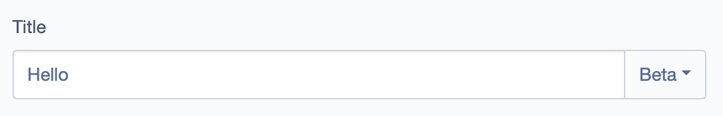
The field we'll be making is a text field with a dropdown for a header which looks like the following:
Getting started:
We're going to use a really nicely made starter kit for Silverstripe modules. This provides you with the basics for creating any number of new modules. We'll navigate to the starter module and click "Use this template"
Once we've set it up we're going to want to first make a few edits to the composer.json to the module before we try and use it in our projects for development. You're just going to want to change the name of the module to what you'll be calling it and update the autoload settings. You can see the change I made here
We'll now add it to our development project by updating the composer repositories to include the new repo, in my case it looks like this:
{
  "require": {
    "adrhumphreys/silverstripe-textdropdownfield": "4.x-dev",
    "normal-silverstripe-project-requirements": "not included for simplicity"
  },
  "repositories": [
    {
      "type": "vcs",
      "url": "https://github.com/adrhumphreys/silverstripe-textdropdownfield.git"
    }
  ]
}
Creating the PHP field
For this we're going to be using two different field types so we're going to extend FieldGroup like so:
<?php

class TextDropdownField extends FieldGroup
{
    protected $schemaDataType = FormField::SCHEMA_DATA_TYPE_CUSTOM;

    protected $schemaComponent = 'TextDropdownField';

    /**
     * @var TextField
     */
    private $textField;

    /**
     * @var DropdownField
     */
    private $dropdownField;

    public function __construct(
        string $name,
        ?string $title = null,
        string $textRelation,
        string $dropdownRelation,
        array $dropdownSource
    ) {
        $fields = [
            $this->textField = TextField::create($textRelation),
            $this->dropdownField = DropdownField::create($dropdownRelation)
                ->setSource($dropdownSource)
        ];

        $this->addExtraClass('text-dropdown-field');
        parent::__construct($title, $fields);
    }

    public function getSchemaStateDefaults()
    {
        $state = parent::getSchemaStateDefaults();
        $state['textField'] = $this->textField->getSchemaState();
        $state['dropdownField'] = $this->dropdownField->getSchemaState();
        return $state;
    }
}
Let's go through each of these parts:
$schemaDataType, we're using custom here since we don't have a specific data type$schemaComponent, this is the name of the react component we'll create later on__constructcan be read and understood easily enoughgetSchemaStateDefaults, here we add in the textfield and dropdown fields schema data
React component
You'll need to add in the required dependencies, for this I'm using reactstrap which is the framework that the Silverstripe CMS is using. A quick yarn add react react-dom reactstrap will do the trick.
We'll then need to create the react component which represents the field. We'll break this one down by adding comments in the code. This file is located at client/src/components/TextDropdownField.js
import React, { useEffect, useState } from "react";
import fieldHolder from "components/FieldHolder/FieldHolder";
import {
  DropdownItem,
  DropdownMenu,
  DropdownToggle,
  Input,
  InputGroup,
  InputGroupButtonDropdown,
} from "reactstrap";

const TextDropdownField = (props) => {
  // textField and dropdownField were passed to us from `getSchemaStateDefaults`
  // which we set previously. `onAutofill` is a function that is passed to us by
  // the React form builder in Silverstripe
  const { textField, dropdownField, onAutofill } = props;
  const [dropdownOpen, setDropdownOpen] = useState(false);
  const [content, setContent] = useState(textField.value);
  const [dropdown, setDropdown] = useState(dropdownField.value);
  const dropdownOptions = dropdownField.source;

  // Since we're using the state from a property we need to update the
  // state when the property changes, therefore we're using `useEffect`
  useEffect(() => {
    setContent(textField.value);
  }, [textField.value]);

  useEffect(() => {
    setDropdown(dropdownField.value);
  }, [dropdownField.value]);

  // When the field is changed we need to pass that up to the redux form
  useEffect(() => {
    if (typeof onAutofill !== "function") {
      return;
    }

    // This was the function mentioned before it takes a form field name
    // and a value, this allows us to bind the field to that state when it changes.
    onAutofill(textField.name, content);
  }, [content]);

  useEffect(() => {
    if (typeof onAutofill !== "function") {
      return;
    }

    onAutofill(dropdownField.name, dropdown);
  }, [dropdown]);

  // This is just looking for the currently selected item
  const selectedItem = dropdownOptions.find(
    (option) => option.value === dropdown
  );
  // This handles the case where the selected item isn't
  // passed through as the source item as it's been removed
  const selectedTitle = selectedItem ? selectedItem.title : dropdown;

  return (
    <InputGroup>
      <Input
        name={textField.name}
        value={content}
        onChange={(e) => setContent(e.target.value)}
      />
      <InputGroupButtonDropdown
        name={dropdownField.name}
        addonType="append"
        isOpen={dropdownOpen}
        toggle={() => setDropdownOpen(!dropdownOpen)}
      >
        <DropdownToggle caret outline>
          {selectedTitle}
        </DropdownToggle>
        <DropdownMenu>
          {dropdownOptions.map((option) => (
            <DropdownItem
              dangerouslySetInnerHTML={{ __html: option.title }}
              value={option.value}
              disabled={option.disabled}
              onClick={() => setDropdown(option.value)}
            />
          ))}
        </DropdownMenu>
      </InputGroupButtonDropdown>
    </InputGroup>
  );
};

// `fieldHolder` wraps our field in the default Silverstripe field divs and classes.
// We use this to make our UI look consistent
export default fieldHolder(TextDropdownField);
We now have a component but we need to register it with the Silverstripe react instance. To do this we can edit the file located at client/src/boot/registerComponents.js. We're just importing our component and then registering it.
import Injector from "lib/Injector";
import TextDropdownField from "../components/TextDropdownField";

export default () => {
  Injector.component.registerMany({
    TextDropdownField,
  });
};
Now we need to ensure the JS is always loaded, we usually did this by adding in the requirement onto the field constructor. With react fields however, we won't ever know when the field is going to be used ahead of time. Therefore we'll add in a config file in _config/config.yml that always loads the JS.
---
Name: textdropdownfield
---
SilverStripe\Admin\LeftAndMain:
  extra_requirements_javascript:
    - "adrhumphreys/silverstripe-textdropdownfield:client/dist/js/bundle.js"
We're now in a spot where we can run a dev/build?flush=1 and start using the field in a React context. You could add this to an element like so:
<?php
private static $db = [
    'TextContent' => 'Varchar',
    'DropdownContent' => 'Varchar',
];

public function getCMSFields()
{
    $fields = parent::getCMSFields();

    $source = [
        'p' => 'Paragraph',
        'h1' => 'Header 1',
        'h2' => 'Header 2',
    ];

    $fields->addFieldToTab(
        'Root.Main',
        TextDropdownField::create(
            'SillyOldName',
            'TitleUsersSee',
            'TextContent',
            'DropdownContent',
            $source
        )
    );

    return $fields;
}
Entwine
Now we'll need to make this field work on the likes of the page/model admin. First we'll start by adding a template for the field in templates\AdrHumphreys\TextDropdownField\TextDropdownField.ss. We're being a little lazy here, the text input will be created correctly and sent as form data, the dropdown however will not and therefore we need to create a hidden input which will hold the form state.
<div $AttributesHTML data-state="$SchemaState.JSON">
  <%-- Field is rendered by React components --%>
</div>
<input $DropdownField.AttributesHTML hidden />
Now we can create the entwine JS file at client/src/legacy/entwine/TextDropdownField.entwine.js and like in the react component I'll just add in comments:
import jQuery from "jquery";
import { loadComponent } from "lib/Injector";
import React from "react";
import ReactDOM from "react-dom";

jQuery.entwine("ss", ($) => {
  // We're matching to the field based on class. We added the last class in the field
  $(".js-injector-boot .form__field-holder .text-dropdown-field").entwine({
    onmatch() {
      // We're using the injector to create an instance of the react component we can use
      const Component = loadComponent("TextDropdownField");
      // We've added the schema state to the div in the template above which we'll use as props
      const schemaState = this.data("state");

      // This is our "polyfill" for `onAutoFill`
      const setValue = (fieldName, value) => {
        // We'll find the input by name, we shouldn't ever have the same input
        // with the same name or form state will be messed up
        const input = document.querySelector(`input[name="${fieldName}"]`);

        // If there's no input field then we'll return early
        if (!input) {
          return;
        }

        // Now we can set the field value
        input.value = value;
      };

      // We render the component onto the targeted div
      ReactDOM.render(
        <Component {...schemaState} onAutofill={setValue} />,
        this[0]
      );
    },

    // When we change the loaded page we'll remove the component
    onunmatch() {
      ReactDOM.unmountComponentAtNode(this[0]);
    },
  });
});
We now need to update the bundle to include our entwine file. We'll update the main bundle at client/src/bundles/bundle.js
// Legacy Entwine wrapper
require("legacy/entwine/TextDropdownField.entwine.js");
// Boot entrypoint
require("boot");
Now we've wired the field up to work in entwine too, just like before you can set up the field but this time you can use it in a non react context
Conclusion
There's more that this hasn't touched on. If you want to view this in full you can find it here. I'll list some recommended reading and examples which can prove helpful when creating fields:
- Introduction to react layer
- Focus point, an example field in react only
- Elemental has some custom fields
- Link field, has a more deep entwine setup
If you make any new fields or documentation/tutorials, flick me a message and I'll add them to the list

